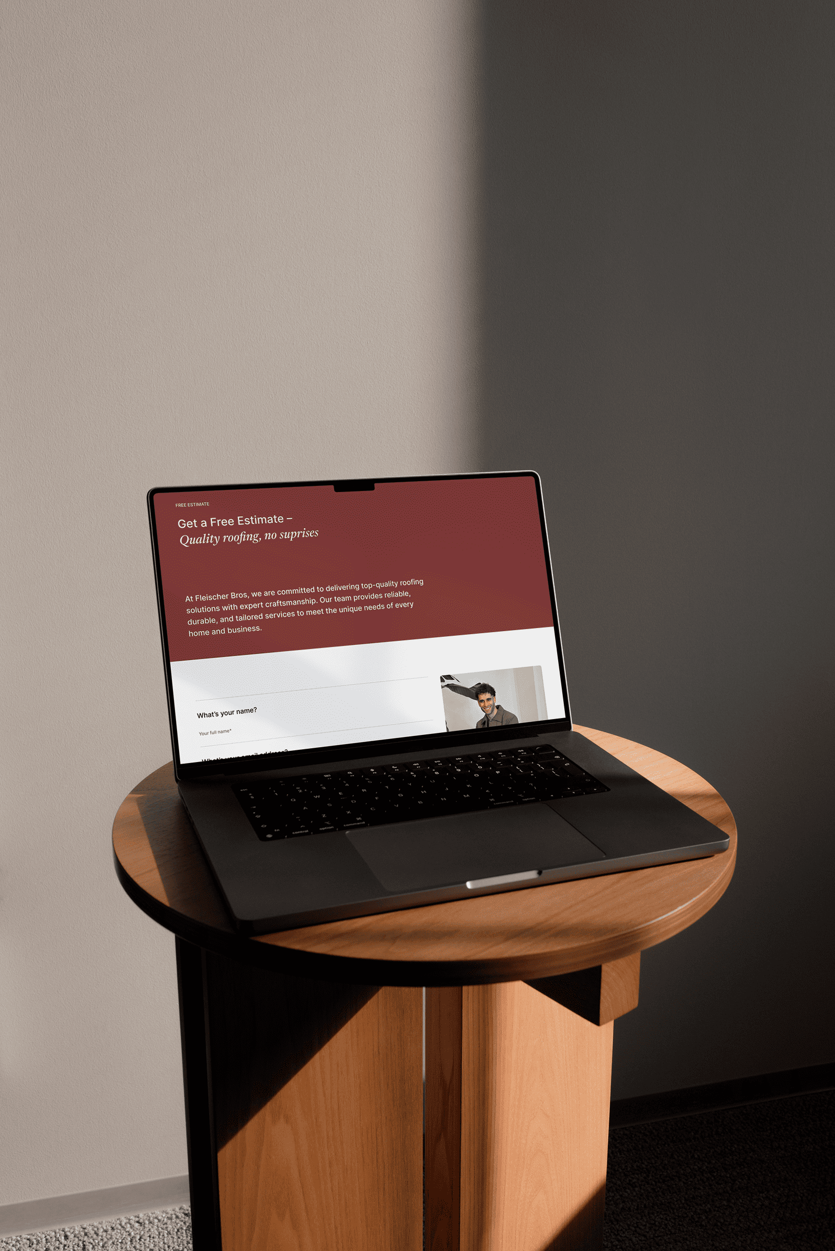
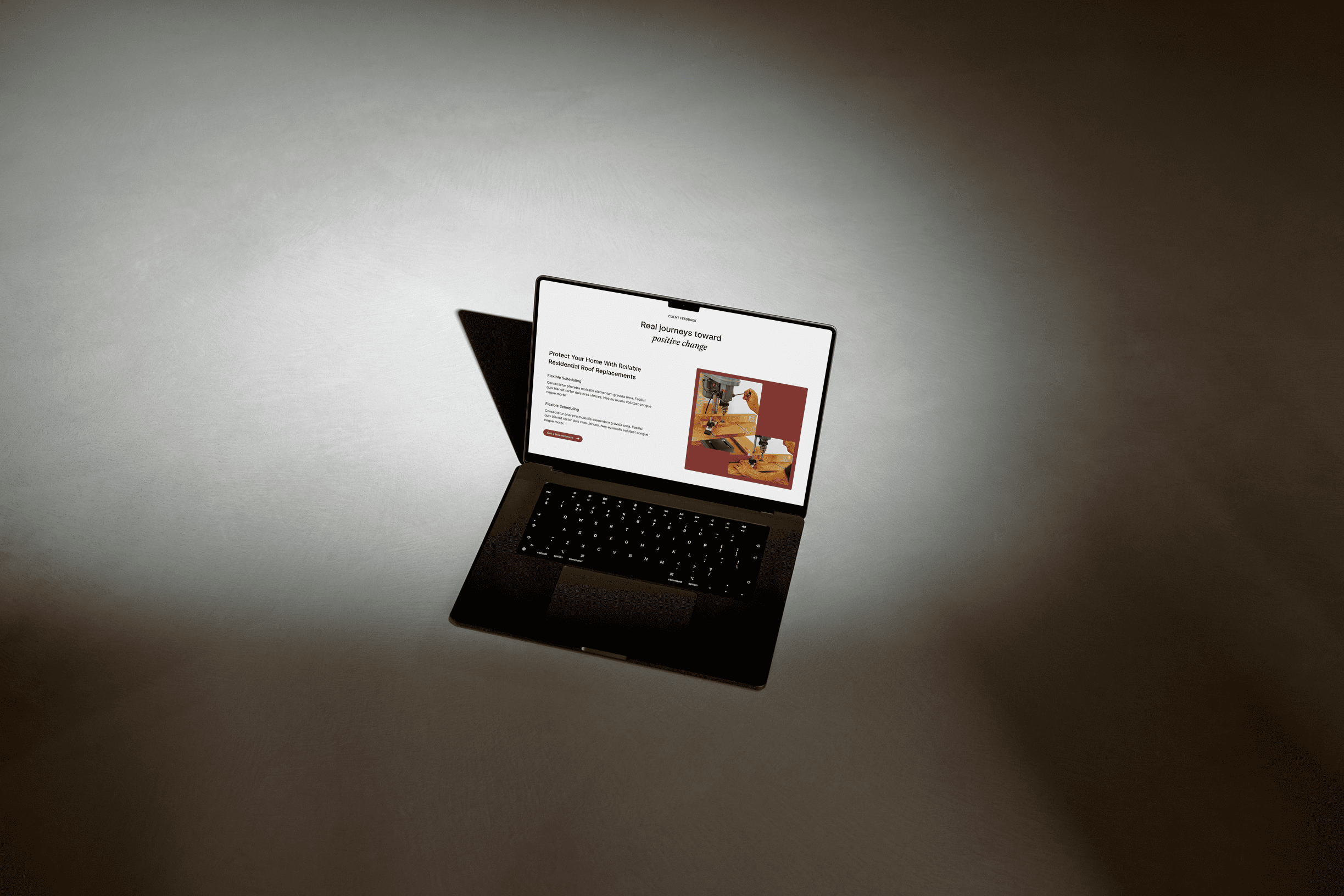
Blynk has helped Fleischer Bros lift its entire digital presence, from website and structure to content and visual profile. A project in which we combined artisanal tradition with modern design, ensuring that the company appears as solid online as on the construction site.
A warmer and more human health experience
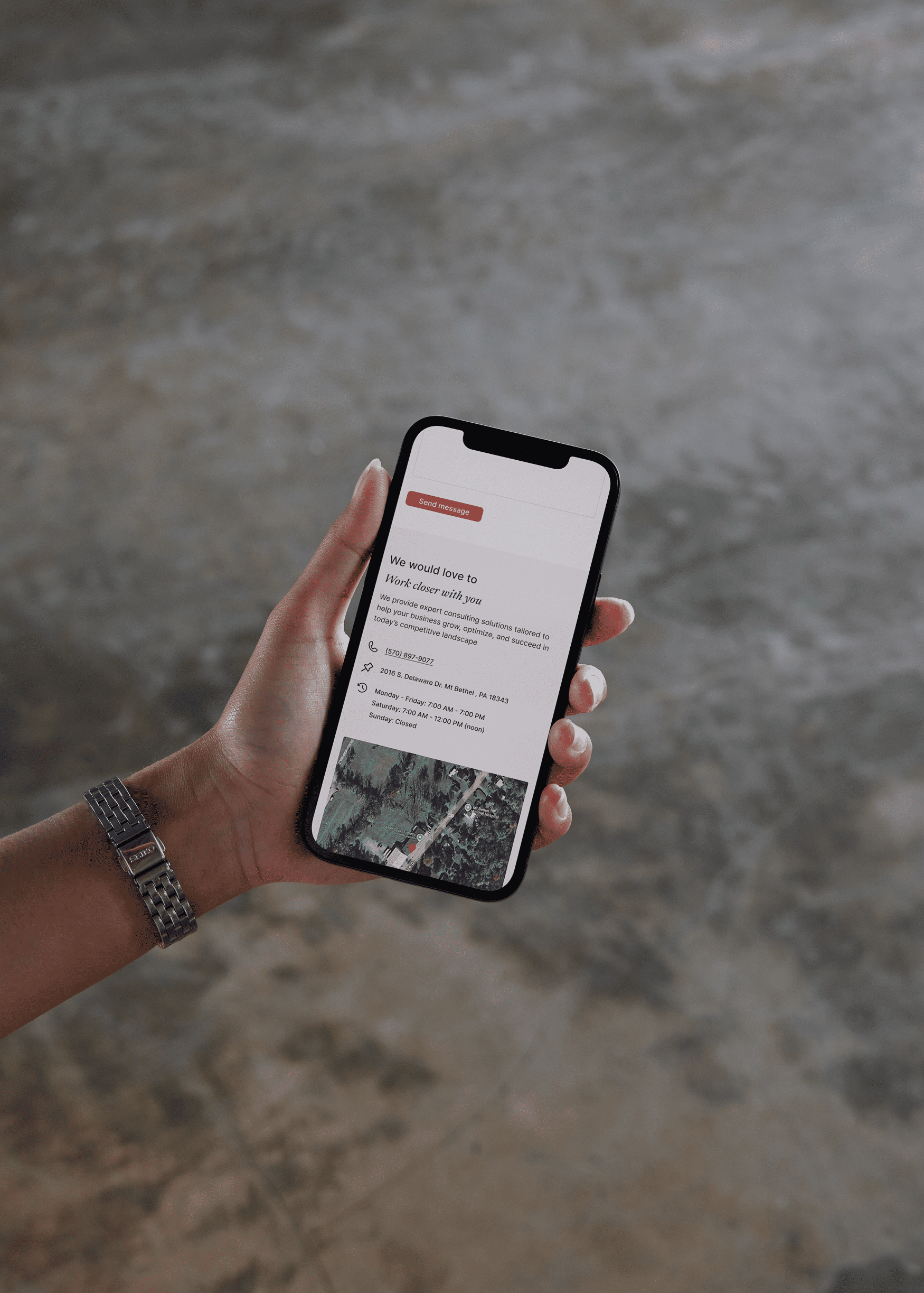
Trygg Helsesjekk wanted to make it easier for people to take care of their health, without it feeling cold or overwhelming. Together we saw the opportunity to shape a new standard for private healthcare that puts the patient at the centre and speaks to people in an understandable, calm and inviting way. We developed a visual profile, website and communication strategy that builds trust, lowers the threshold and gives a clear voice to professional security.
Vi utviklet en moderne nettside, en visuell profil og en tydelig struktur som gjør det enkelt for potensielle kunder å finne informasjon og ta kontakt. Resultatet er en helhetlig digital tilstedeværelse som oppleves både profesjonell og menneskelig, bygger tillit og gir målbare resultater i form av økt synlighet og flere leads.
A warm and modern health site without unnecessary noise
The design for Fleischer Bros is built around clarity and confidence. We chose a visual style that is clean and modern, but at the same time down-to-earth, so that it reflects the company's craftsmanship and long traditions. Color use and typography are carefully balanced to provide a professional expression that feels stable and reliable, without being cold or distanced.
Through a tight visual line and a consistent idiom, we have created an expression that is both safe and accessible. Large surfaces, good use of air and clear hierarchies make the content easy to read, while the design allows space to convey the company's identity in a clear way. The result is a website that feels modern, solid and human at the same time.


-min.avif)

We built a visual identity that combines serenity, professionalism and ease of use across the entire experience
We developed a visual identity that combines professionalism, warmth and ease of use across all sides. The color palette was put together to give an impression of calm and stability, with tones that reflect seriousness without becoming sterile. The typography is modern and easy to read, while providing a friendly and human touch. The logo acts as a clear anchor in the design and contributes to recognition and consistency.
Through careful selection of button styles, text sizes and layout, we have created a balance between aesthetics and function. Structure and content are designed to be intuitive, so that both experienced and new users find their way around without friction. The result is a digital experience that feels neat, professional and confidence-inspiring — an expression that strengthens the brand and lowers the threshold for reaching out.