We have designed Powertrain's website and developed a distinct visual identity that strengthens the company's digital presence. Through close cooperation, we have delivered everything from structure and design to color usage, typography and expression. In addition, we have produced visual content, including video and photo, which is used in the company's cross-channel communications. The aim has been to build a professional and modern presentation of Powertrain that reflects both expertise and ambition.
A new and more precise digital identity
Powertrain AS provides technical solutions and services to industry, with leading expertise in power transmission and mechanical components. They are an important player in the industry, but the previous website did not give a proper impression of the professionalism and breadth of what they offer. The website was outdated, cumbersome to navigate and worked poorly on mobile and newer devices.
We were brought in to modernize the whole digital expression. Together we developed a new website from scratch, with a clearer visual language, better structure and updated content. In addition, we produced new photos and videos that show both employees, products and work processes in a clear and professional manner. The result is a website that mirrors who Powertrain is today -- and where they're going next.
A visual boost with real people, real work and a new narrative of who Powertrain is today
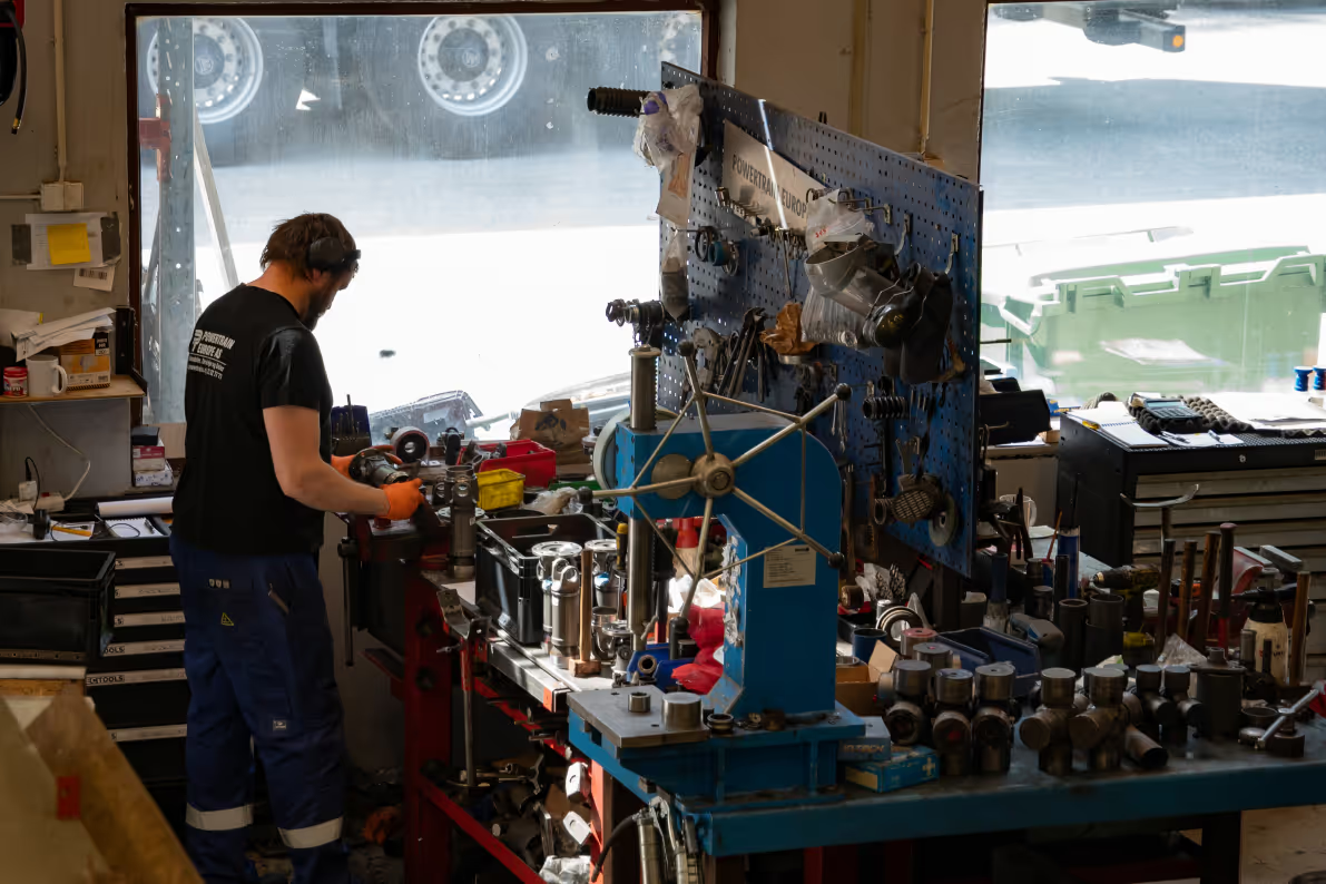
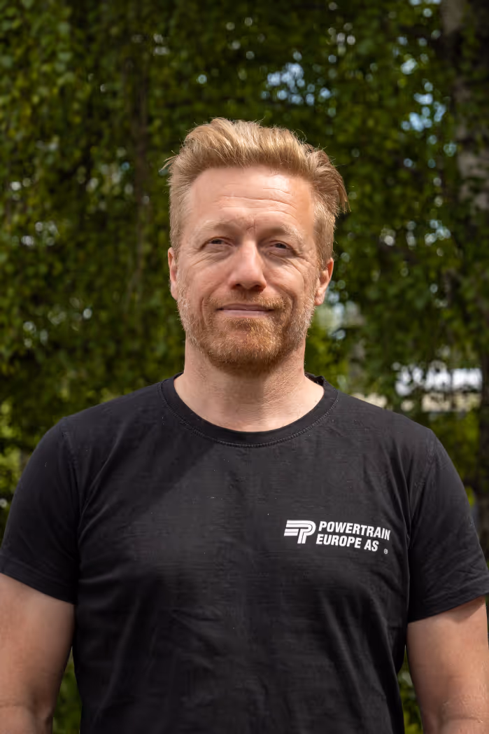
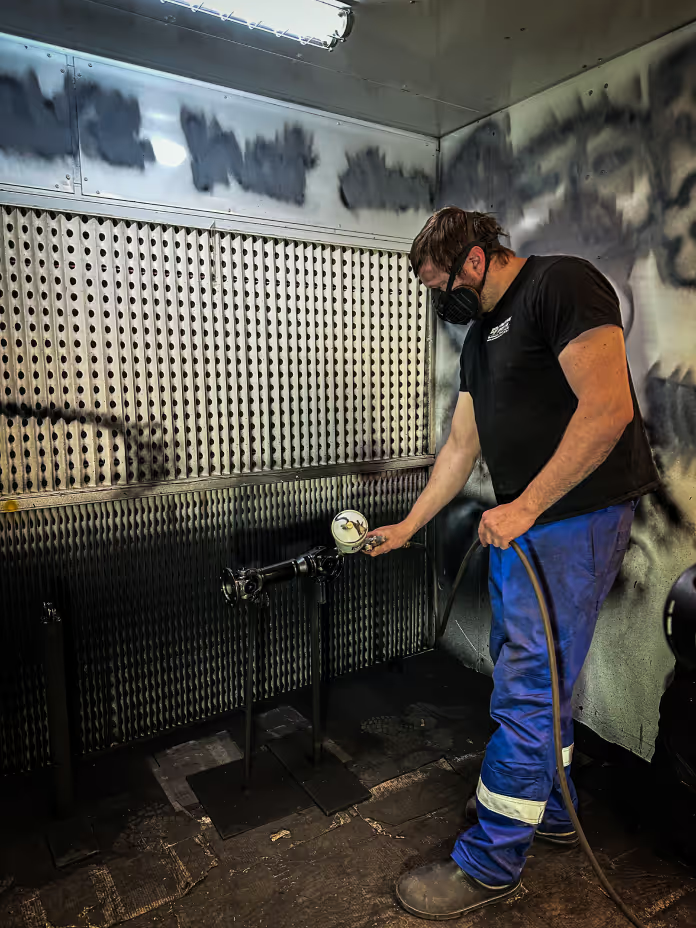
We were commissioned to give Powertrain a new visual expression through photography that mirrors their everyday lives. From portraits of employees to images of welding work, machining, varnishing and workshop environments, we wanted to show the breadth of work and the people behind the logo. This is not just about components and parts, but about professionals who know the details and stand for quality at every stage.
The photographs were used both on the new website and in other marketing materials. By documenting the workplace as it actually looks, we have created an image style that is honest, clear and professional. This was an important part of the process of renewing Powertrain's digital presence and strengthening its brand in a way that feels both relevant and credible.


A new website that combines industrial precision with a clear and modern expression
Powertrain needed a new website that actually reflected who they are today. The old solution was outdated and difficult to use, especially on mobile. We drew inspiration from the industry itself — from the lines in the components, the colours in the workshop and the practical everyday life of the company. The website was built with a clear structure, large contrasts and good readability, so that both new and existing customers can easily find what they need.
Everything is developed with function and flow in mind. From the start page, we quickly lead the user into either products, services or contact, without unnecessary detours. We let the images fit, let the typography and colors build the brand, and made sure that the whole expression matches what Powertrain stands for -- quality, precision and good craftsmanship delivered by people who know what they're doing.


A collaboration with good drive, good mood and strong results
The collaboration with Powertrain was as steady as the axles they work on. From the first meeting we noticed that this was a group with high expertise, zero fuss and good coffee at lunch. They knew what they needed and gave us both the freedom and clear framework to develop a solution that actually elevates their brand in an honest and effective way.
The process became a good mix of structured design work, action-packed photoshoots and pleasant conversations about everything from welding to semi-complex company names. We were left with an end result we're proud of -- and the feeling that we were working with a bunch that really cares about what they deliver. Just the way we like it.